Interface Design for Machine Learning
Role:
UX Designer
Collaborators:
UX Designers
Engineers
Product:
SilverCloud Health
Alongside the recent growth in digital treatments for mental health, there has been a rise in the exploration of how machine learning can be used in this field. Much of the research so far is focused on the efficacy and accuracy of machine learning models, with little research into how these models will work in the real-world applications.
Over the course of a three-year, multi-disciplinary research collaboration between SilverCloud Heath and Microsoft Research (MXR), an outcome prediction tool was developed based on machine learning models. This project involved diverse team of researchers with backgrounds in Machine Learning, Clinical Psychology, HCI, Design, Engineering and Data Compliance. By using machine learning models to predict outcomes, we can determine at an early stage whether or not a patient is likely to improve, creating the opportunity for clinicians to adapt their approach to ensure treatment success.
Outcome Prediction in context
Users of SilverCloud work through their program content with the help of a trained supporter, in the form of weekly or bi-weekly reviews through the platform. To review a user’s progress, supporters can see what a user has done on the platform in the previous week, see any messages the user might have sent and their answers to clinical questionnaires. The goal of the outcome prediction tool was to help identify users early on who are not progressing as expected and may be at risk of poor outcomes. With this information, supporters could change their approach as necessary and increase the likelihood of a patient improving.
Taking a human-centred approach
Once the ML model had been developed, it was up to the design team to understand how to design a UI for the tool that supporters could understand, interpret, and effectively action within their workflows. A human centred approach was taken in the development of the model, talking to supporters from the outser about what sort of UI would work for them. We wanted to continue this approach in the design of the interface for the tool, working closely with supporters to develop the design.
We developed a set of initial visualisations of the model that could be reviewed with supporters. The aim of these sessions was to understand how the outcome prediction tool could fit into their workflow, what design was the most understandable and what level of contextual information was needed to aid in the understanding of the tool. One of the key design challenges was creating a UI that would allow supporters with only a basic knowledge of machine learning understand and interpret the outputs of the prediction tool.
The initial design concepts were intentionally quite different from each other, what the aim of representing several different ways of understanding data such as visually, textually, numerically, etc. We also wanted to understand how the use of colour affected the interpretation. The result of these sessions was a design that used a combination of these to accommodate for different learning styles and preferences for reading data.
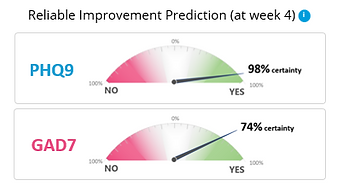
Wheel indicator

Population comparison

Multiple outcomes table

Visual cue + text
Concept testing & design revision
We tested these concepts with through interviews with 13 supporters. One of the main insights was that supporters liked something that can be read at a glance. Visualisations that were too complex or wordy didn’t work as these supporters are often under time pressures and the prediction is just one of a number of things they take into consideration when doing a review. This lead to the approach of scaffolding information through progressive disclosure, giving the minimum information but having more available if needed. Colour choice was also something that needed to be carefully considered, designs that included red invoked strong reactions. Certain visual representations could be misleading, for example the wheel was perceived as a scale for deterioration to improvement, rather than just the likeliness of reliable improvement.
We took these learnings and developed a UI that we believed had the right balance of information. The visual indicator alongside the label allows supporters to understand the prediction at a glance. More information is available in the info button if needed but doesn’t clutter the interface. Several rounds of iteration were needed on the text to ensure it would give an accurate understanding of the prediction and reduce the risks of misinterpretation.
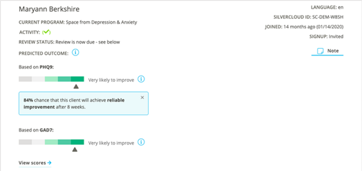
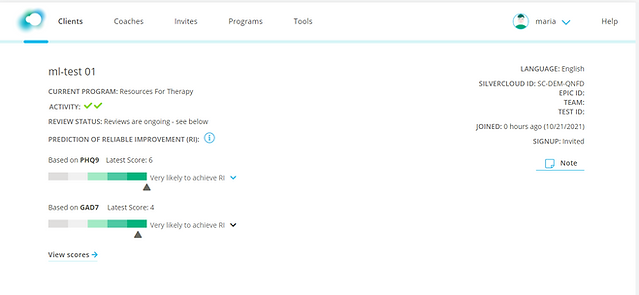
UI that was built for the pilot
Pilot study
A pilot study was conducted with 6 supporters in the US to understand how the supporters incorporated the tool into their workflow as well as the understandability and acceptability of the tool. The tool was made available to the supporters for a period of 8 weeks and interviews were conducted with each supporter every second week, with a focus group at the end of the 8-week period.
Overall feedback on the tool was positive, with all of the supporters indicating they would like to continue to use to the tool. There was also a high level of trust in the accuracy of the tool. Certain use cases caused issues in interpretation, for example clients who scored low on the PHQ-9 or GAD-7 might receive a negative prediction as the threshold for reliable improvement is a drop of 6 points. However, as these clients already have low scores and minimal symptoms, they are doing well. Use cases such as this led to extra limitations being added to the tool to ensure it would only make predictions for clients who can achieve reliable improvement and an explanation added as to why there is no prediction available for these clients.

Situation 1: not enough information to make a prediction

Situation 2: Unlikely to improve
Situation 3: Likely to improve
Further Research & Publications
Following on from the pilot study, there is now an RCT (randomized control trial) in progress to test the acceptability and clinical use of the tool with supporters at Berkshire NHS Trust in the UK. This trial will be the first to test a machine learning predication tool for a digital platform within the field of mental health. To learn more about the RCT, see the blog link below.
An academic paper was also written discussing this project in more detail: