Data Reporting Dashboard
My role: project plan, research, wireframing, UI/UX design, CSS.
Background
SilverCloud Health is a digital mental health platform that provides clinical programs to healthcare payors and providers such as the NHS in the UK and Kaiser Permanente in the US. Clients of these healthcare services can avail of one of SilverCloud’s programs which is often prescribed by a doctor. In most cases, clients will use the program with the support of a mental health coach, who will check their progress and provide guidance.
Customers of SilverCloud need to understand how clients are using the platform and if they are achieving good mental health outcomes at an individual level, and as an aggregate. There was an existing stats page that provided this information, however the design of this page hadn’t been updated in some time and customer needs had evolved. To compensate for this, customer success teams were spending a lot of time compiling reports manually for key customers.
A redesigned dashboard would improve efficacy and validation by facilitating a better understanding for customers of what they can gain from SilverCloud and how to make it work for their service.
Challenge/Problem statement:
The challenge was to uncover what metrics best show the value of Silvercloud to customers and how to present these metrics to customers to ensure their understanding.

Research - What were the most important metrics to measure the success of a service/customer site?
I started with interviews with internal stakeholders to get a sense of what was needed.
-
Interviews with customer success – what reporting requests were customers bringing in that couldn’t be fulfilled by the current dashboard.
-
Interviews with the clinical research team – what data reports were they putting together for customers and for internal reporting.
-
Gather a list of all the metrics needed and sort them into categories, prioritize them.
We gathered that there is two types of customers when it came to data reporting. The first group are customers that had been using a digital solution for a while, had already identified their own success metrics and what data was important to them. There is another segment of customers who are in the healthcare space but are only starting out with digital mental healthcare solutions and are unsure what metrics are important.
In summary, part of this project was to display the dashboard in such a way that we could educate customers about how to measure Silvercloud in their healthcare service, and, additionally, to educate them on what metrics are important and why. The decision on which metrics to include in the dashboard was primarily influenced by Silvercloud’s research team and then validated by the customer success team and customers.
Design
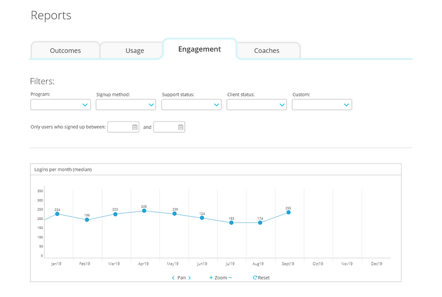
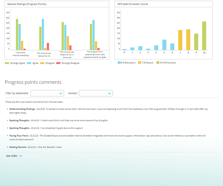
An important element of the design was to make the dashboard understandable, and not overwhelming for users who were new to the data. To do this I separated the data into categories and used a tab structure to allow users to move between these categories. The first and more important category was outcomes, the measures that show if users of SilverCloud are improving and their symptoms are decreasing. I included several info buttons throughout this and other tabs to add explanations of the data & definitions in context. This info button is already a pattern used elsewhere in the platform so would be familiar to users of the dashboard.
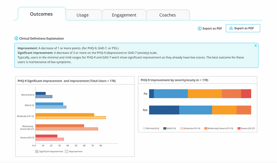
Screenshot showing tab structure, info buttons & clinical outcomes graphs
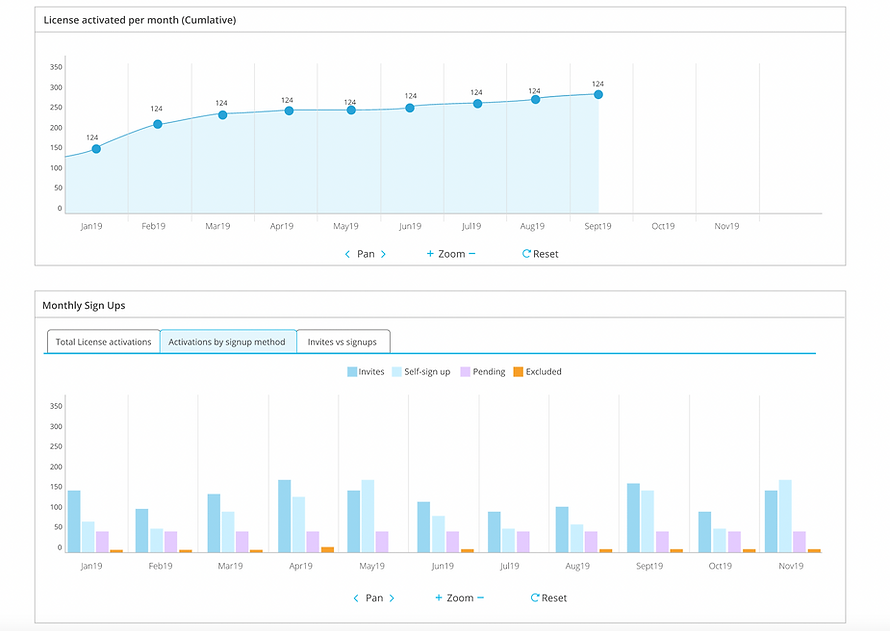
Screenshot showing monthly user activations graphs
Filters
Advanced users of the dashboard are looking to create custom reports, a common one is outcomes and usage numbers over a recent month or quarter. The filters at the top allow users to do this. There were filters in the old stats page but they have been updated in style to match the rest of the platform and organized in an order that makes more sense for the workflow. Customers with unique implementations can add custom filters to this section to make it more relevant, or example customers who are providing a service in multiple languages can add a language filter. This approach ensures customers only see filters that are relevant to them beyond the basic set.
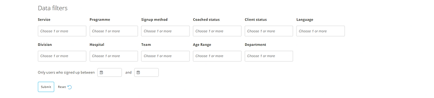
Screenshot showing data filters
PDF Export
One of the top requests from customers was the ability to export the data in a format that be shared easily. There is an existing export function that exports the data to csv format but customers wanted an easily accessible PDF that could be shared with others in their organisation. This feature required a close collaboration with developers to understand what sort of PDF feature could be added to the page and how it would work. The research and design were done in tandem, testing out different plugins & options with developers before settling on one that fit our requirements.
Development & Release
The overall design of the dashboard was shipped as planned with some minor tweaks. There were some bonus graphs added and upgrades to the design that were easy for the dev team to add during the build with the help of existing libraries. For example the module feedback section that shows qualitative feedback, was upgraded through the use of a plugin to a table format that allows the user to filter by module, rating or search through the comments for a particular topic. These types of changes came about through very close collaboration with the developers throughout the design and development phases.
Mockup of the design to view user comments, with 2 filters.
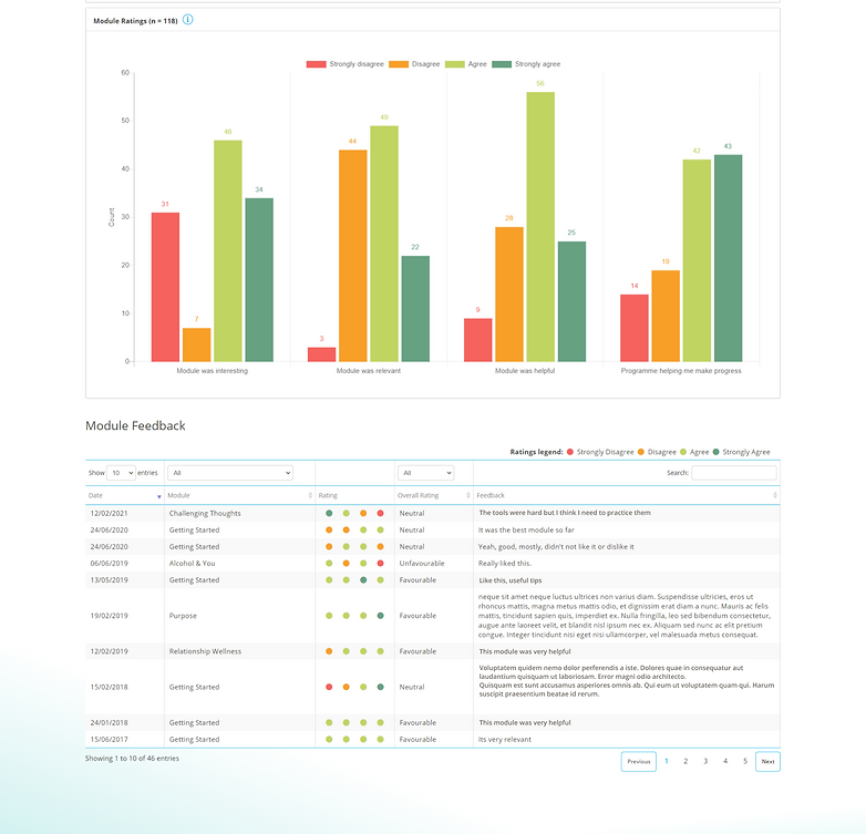
Table component that was built with extra filters & a search bar.
Once the main components and graphs were in place, I also worked on the CSS of the dashboard to align the layout with the mockups and account for the small changes that were made during development. Testing was done by internal team members for bugs and usability. It was then piloted with a few key customers to ensure every thing was working as intended and to get initial feedback on the design. After this pilot there was a general release of the dashboard to all customers. It has now been live for over a year and received good feedback from customers. It also achieved the goal of removing the manual work that was being done by the CS team to compile reports for customers.